Tuesday 24 December 2013

Tricky Kid

Tricky Kid

Many thanks to everyone who's checked into my blog over the last twelve months - especially those who've left a comment or emailed - always very welcome. As far as 2013 postings were concerned, I was down a bit on this year compared to last year, so I endeavour to make an improvement on uploads in 2014.

That's it from me until the new year. Keep your pencils sharp and Merry Christmas!

Thursday 12 December 2013

Tuesday 3 December 2013

The last roots train has left the station... goodbye, Junior Murvin

Sad to hear this morning of the death of Junior Murvin. Like everyone else with working ear drums, I love his collab with Lee Perry on Police & Thieves, but his other songs are well worth checking out.  If you like his falsetto delivery and LSP's Black Ark production then I recommend  his first album - also titled 'Police & Thieves' - as a good entry point to his catalogue. Roots Train is a cracking opener...

Thursday 28 November 2013

Stuart Broad

Ah, the fluctuating fortunes that comprises English national cricket. It's all handbags at the mo' aint it? Still, here's an oddly beatific looking Broad - don't know what happened there...

Saturday 16 November 2013

Tuesday 12 November 2013

Michael C Hall

Although I had every intention of doing a nice stretch with Mr Hall's face - and he's got a great face to stretch with - this drawing ended up straightening itself out as I progressed. It sort of finished up as a half-way-house between a portrait and a caricature. Don't mind too much as the purpose of the exercise was to concentrate on getting symmetries and levels correct. Good practice.

Monday 11 November 2013

Sofie Gråbøl

Was intended to be a rough and chewy sketch like the last post but it got more and more involved. Great face!

Sunday 10 November 2013

Walter White

A very rough sketch of the hit character Walter White from Breaking Bad, played by Bryan Cranston. Would be cool to colour up...so maybe I'll do just that, when I get 5!

Saturday 9 November 2013

John Cole

Another distinct BBC voice from the past, now silent.

Luis Suarez

I don't usually like to mix colour with cross-hatched black & white drawings. Not sure why; something to do with wanting the hatching to do all the work, perhaps, but every now and then I let it go. When I finished this one, and was thinking on this issue, I remembered the late, great, French cartoonist Claude Serre whose books I'd owned from a very young age. He was definitely a big influence on me and worth checking out if you're not familiar with his work. His cartoons all involved highly detailed and cross-hatched black & white pen work, which made a virtue of the fact that the focus of the piece was usually rendered in colour. Well, if it was good enough for Monsieur Serre...

Call It, Friend-O!

I've been working my way through the books of Cormac McCarthy who has held top spot in my favourite authors poll for a while now. Though I watched the film adaptation No Country For Old Men back when it came out I've only just recently finished reading the book. So here's my little bit of fan art for a great modern bogeyman of modern literature, Anton Chigurh, who lies at the black heart of it all. Beautifully played by Javier Bardem, of course...

Friday 8 November 2013

John Bishop

Got about 50% through this with everything going great when the computer crashed. I always save as I go along but this time the computer acted weird and I'd somehow managed to save the file with the image half off the edge of the drawing area, thus cropping John's face. Useless! Nothing worse than starting over when you felt you'd nailed the original, as you never think you can replicate it - let alone getting back the wasted time. Oh well, I'm quite happy with version two (which somewhat lessens the pain!) but I could've done without it.

Friday 25 October 2013

Silk Purses & Sow's Ears

As anyone who puts their caricature services out there will know, you very quickly compile a set of requests and 'conditions' that you ask of your customer in order that they get the best possible piece of artwork that you can deliver. These can involve things like payment terms, lead times/delivery and reference images, etc. They exist to ensure that the commsission runs as smooth as possible with everyone coming out happy from the arrangement.

This post was prompted while musing on reference images: the photos that the customer sends of their boss/spouse/kids/best man, etc. which you're going to use to capture their likeness.
I always ask for clear headshots of the subjects, which are preferably taken somewhere between mid-to-close-up and not across the other side of a conference hall; and preferably in natural light. This last request is a bit of an 'ask' as most photos are taken indoors, often at dimly lit parties. As most caricaturists know, the reason for asking for outdoor images is that the natural light source provides good directional shadows and the architecture of the face is easier to discern.  A photo taken indoors with poor lighting - and with the subject's face lit up with a strong flash - does little to provide interesting contours and elevations - it only supplies the dimensions and positions - which are essential, but not sufficient. The other bugbear is the extremely low res' postage stamp-sized images - ones where all detail is impossible to see regardless of how well lit they are. If you end up with a combination of the two then you have every right to weep into your palette.
The above scenarios happen all too often and I am always suprised that people are willing to pay good money while supplying sub-standard images.

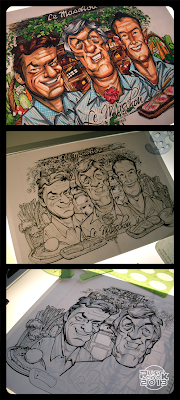
Below is a three-stager of a recent commission which had prompted my thoughts on reference images. The customer was great to deal with, but the deadline was tight and the supplied images of the three guys were very small. The artwork was originally going to be A2 size - a bit of a stretch to fill, regarding the reference image sizes - but just prior to starting the final artwork, the customer changed to wanting it at A3. This was for other reasons entirely - though probably for the best under the circumstances. The reference pictures had the further complication of having a weird form of pixelation, as though they'd corrupted somewhere along the way (I would show them here but I generally don't like to upload photos of people supplied in good faith and without their permission - so please just take my word for it). No more larger, clearer images could be supplied so I had to make good with what I had.

Unipin & Copic Ciao markers on smooth Gold line Bristol Board h/weight paper

All the above made me think further on the many factors that can hamper the smooth running of a commission. As with most jobs, a secondary skill is demanded of the caricature artist - the need for the ability to adapt to the situation. This ability is arguably equal to the primary one of actually being able to caricature in the first place - a fact that is taken as a 'given'.
So, when represented with bad reference photos, vague instruction, poor communication and very tight deadlines, only you can decide whether the commission really is do-able. But once taken on, the goal is to then make a silk purse out of a sow's ear.
Thursday 24 October 2013

Splitter!

After a bit of chin scratchin' as to the wisdom of it all, I decided to create a new blog in order to split the comic/fantasy/cartoon illos from the caricature posts. I usually like to keep things 'similar', so that was one big reason, but the other main incentive was that I have specific caricature links connecting to this blog, so I didn't want to confuse those seeking caricature related stuff. That's not to say you won't ever see the odd recognisable fizzog slipped in over there, but it's mainly going to be a dumping ground for pics 'n' stuff from the more crepuscular regions of my noggin'. So if you like macabre/alien/bot/zombie/space/comic-character/fan-art/pulp/gals then it might repay you a visit...

Thanks for checkin' in - fresh stuff soon...

Tuesday 27 August 2013

Recent Digital Commission

A recent commission. Was cool to do some digital again...
Very busy at present and am itchin' like insanity to get to do some personal stuff.
But. There. Is. Just. No. Time.

Thursday 15 August 2013

Great words from Tom Richmond...

Tom Richmond's well-written and informative column is always worth a read, and his latest post is a great insight into how to go about trying to earn a living through humorous art and what your expectations should be. It's encouraging and realistic - go check it out.

Tuesday 16 July 2013

Underbite from the underworld...

Acrylic paint on A4 200gsm Goldline watercolour paper

Agh, but it's been a while. This has been my longest gap between posts, ever - but it's not through idleness, faithful visitor. Just very very busy with the day job - which tends to spill over into the 'evening job'...
I've managed to grab a bit of time here and there just for painting and drawing some fun stuff that doesn't involve too much brain power - which is how I like to relax. So it's another look-in for the undead!

I've been enjoying painting a lot recently. Digital is bloody marvellous but if the computer's not behaving then it becomes a hideous experience. I've got a lot of that at the moment, so I've mainly eschewed the virtual and found refuge in the actual - you just can't beat the real thing. When was the last time your paint brush gave you an error message or found that your tubes of paint had crashed? Exactly.

That being said, I should be on for a cool digital vector commission soon (which is rare) and if all goes to plan I'll post it here.

Anyway, back to this post's paint job: coupla progress shots here:


Friday 14 June 2013

Judge Death in Colour

Inks: Sketchbook Pro - Colours: Photoshop

Just thought I'd throw some colour at it, just to tickle myself. Don't know why he's being zapped but it's sure making him gurn. Shouldn't wear a metal lid in a thunderstorm, p'raps?

Wednesday 15 May 2013

ISCA Korea Competition Entries

 Yoo Jae Suk

Park Won Soon

Above are my two entries for this year's ISCA competition to be held in Seoul, South Korea. Bit of a fandango trying to get them uploaded - the website wouldn't let me upload initially - but I just managed it yesterday, which was the deadline. So, I'm afraid you're too late if you were thinking of having a crack yourself. Although there was an option to choose from among a hundred faces - some international stars, others South Korean luminaries - I thought I'd go for 'local' faces as it seemed more interesting to me. 'Was fun doing some research into the various subjects to see who would be good to caricature; not only image searching them, but also watching Youtube vids to get a feel for the character. Always intriguing to see how other countries interpret concepts such as reality shows and talk shows for television, and how humour is appreciated and in what style it's delivered. An education.

Next!

Sunday 21 April 2013

ISCAKorea Sneek-Peek.

Finished my two characters for the Korean ISCA caricature competition. Mr Park Won Soon went sweet as a nut while Mr Yoo Jae Suk fought me all the way - so it goes, ha, ha! I'll stick up their full images when the start date for uploading artwork has arrived. Next!

Monday 15 April 2013

Solidarity With The South...

If you're an online caricature artist then you're probably aware of the following, but if not, you may wish to consider that the ISCAKorea are holding a caricature competition in Seoul this summer and anyone is welcome to enter. I don't usually enter these things but I will this time in a small gesture of solidarity with a peaceful country who have to live in the shadow of an actively belligerent neighbour. If you want to partake then you need to create two caricatures out of a choice of a 100 personalities and upload them to their site. Deadline is May 15th. There are cash prizes to be won, so check their website (link) for more details. Get morphin'!

Sunday 14 April 2013

Landscape

Created in Photoshop - reproduced on stretched canvas

I love all forms of 2d art/illustration and abstract art is no exception. I often manufacture abstract elements into whatever I'm working on even if the final effect's not immediately obvious. Shown above is a landscape (top) that I created recently along with a photo (below) showing a hanging reproduction.

I also like pushing horizon lines way up (or sometimes down) so that an expanded area of sky/earth is shown. I first noticed this approach a long time ago with the landscapes of Gustav Klimt - and it's influenced me ever since. His landscapes are almost totally abstract but are still obvious as to what they are depicting. Check out his 'Farmhouse with Birch Trees' or 'The Park' for examples of extreme horizons...

Wednesday 10 April 2013

Mario Balotelli


Maz.
Uni Pin fineline pens + Goldline Bristol Board paper

I've always enjoyed a love/hate relationship with creating pen & ink caricature work, though I must say its downsides are in no way linked to a misguided view that digital art is superior. It's more to do with the fact that anything (be they malfunctioning computers or poor materials) that retard the speed of creating the image is incredibly frustrating and can also cause an inferior execution when drawing traditionally.

I'm old enough to have have been using traditional materials for a long time before I started down the digital route, but since I started sketching and inking digitally, I've rarely gone back to traditional (unless commissioned to do so) because despite my long experience with it I could never quite get the equipment to work faultlessly, and for me, working faultlessly only 80% of the time is no good. In the past, I inked artwork by toggling between traditional dip pen and rotring pens. Both are great and provided subtle differences in finish, but despite many hours over many years they never proved perfect as the ink flow was always interrupted by the slightest blockage. Even when making sure that the equipment in both approaches were scrupulously clean and all surfaces free from skin contact, flow would always get interrupted and the lines making up my cross-hatching would get scraggier and the whole image would suffer as well as protracting the whole process.
When cross-hatching I always seek to avoid broken flows, i.e.: the line starts and finishes exactly where I want it to. If you go back to fill in breaks it is not only time consuming, you'll also never get it accurate and the line will look wobbly and unsure. If you have a whole image made up of bad lines then the image will look poor regardless of how great your other drafting skills are. A good clean arc or straight line is what you want to get the full effect. This is paramount when inking traditionally as there's no second chance - with digital, of course, you can immediately erase a bad line and re-draw.

So recently I have been buying new pens to experiment with to see if I can bury this old problem.  I bought some fine line markers (by Uni Pin) having always been a bit snobbish when considering them in the past. However, I've found that on Goldline Bristol Board paper they work a charm and give a good finish. They're water proof and they're permanent - both must-have qualities.

Now, with an invigorated spirit and in-love once more with traditional inking tools, I created the above caricature of Mario Balotelli and will be looking to do some more trad images very soon, hoping to polish up my technique.

If you want to buy the original it will be for sale on the 'Art For Sale' page very soon.
Thanks for checking in.

Monday 18 March 2013

Paul Pope

The mighty Paul Pope of NYC: comic artist extraordinaire (amongst other things). If you like your comic art vivid, animated and loose, then check him out.

Just remembered - he's left handed, ha, ha!

Thursday 14 March 2013

Stylin' with Mean

Ah, Mean - my favourite buttist. I was thinking recently about how squeamish current film makers and image creators are about showing the head-butt due to censors applying a more restrictive certficate. No doubt because - as Martin Amis writes in his great book 'Money' - it's a very intimate way of fighting and it appalls and shocks. I remember reading elsewhere about some apparent controversy in the the Lord of the Rings films where there's the odd 'Bok' between Aragorn and the Uruk-Hai. Funny what gets people's danders up when you consider what else is shown on screen. Didn't seem an issue for the creators of 2000AD where, for many characters, it was their preferred method of settling a dispute.
Anyway, I've been trying to nail some sequential styles - with varying results. I've been going back through back-issues of 2000AD to use their story-lines to test some styles - a deadly thing to do as the artwork is so great and can't help but influence my easily malleable approach - not a good thing. The above frame is one of a very few that came out OK - taken from the Dredd storyline 'Dredd Angel' and found in Prog 380 (should you want to see the original frame). That's going back some, citizen.

Monday 11 March 2013

Sunday 17 February 2013

Christine Lagarde

Grande dame, big boss woman - over at that International Monetary Fund place.
Haven't done a detailed drawing for a while so...Voilà!

Friday 15 February 2013

Stuart Freeborn RIP

Here's a quick sketch of another person intimately linked with the Star Wars universe who has finally passed over and become one with the force. Stuart Freeborn, a make-up artist,  may not be instantly recognisable by name but his creations are globally familiar - his most iconic being Yoda (the pea-green, pint size, sith-botherer from the Star Wars films, in case you didn't know). Apparently, Yoda was based on himself - fair play!